Peter Turchi claims that writers are similar to cartographers. As a co-author and illustrator of Bantustan: Atlas of an African Journey, an interactive prose book with a lot of maps and infographics, I couldn't agree more.
This workshop is devoted to the narrative art of communicating insights gained from data analysis. We choose a data sourse, do the analysis, formulate insights, and than try to find the most effective way of communicating these insights. In other words, we're trying to tell a story that includes numbers and measurements.
We mention different dataviz technologies (such as D3.js, Processing, P5.js, Tableau, and Raw Graphs), but the focus is on crafting a story, not on technology.
Special attention is payed to different ways of misleading the public via data stories. With its aura of objectivity and factfulness, the medium of data can be easily used to obfuscate as much as clarify. There are no perfect maps. That is something data storytellers should always keep in mind.
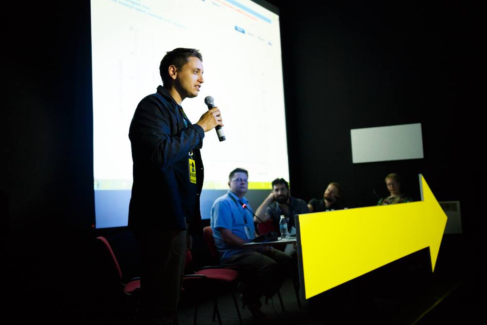
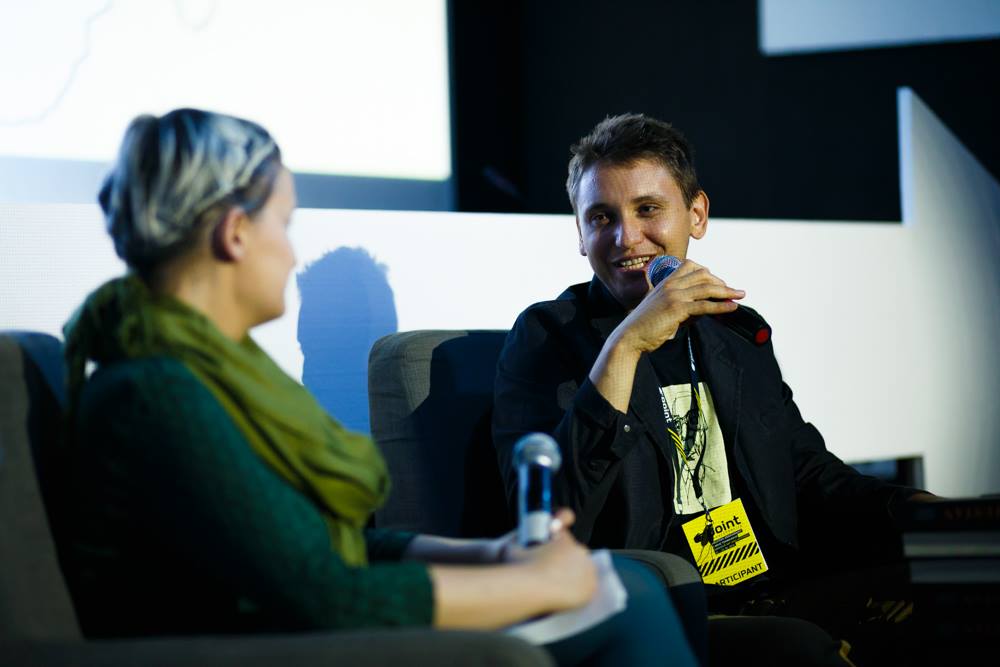
Data storytelling workshops were held in Serbia, Hungary, and Bosnia and Herzegovina. Participants were different kinds of storytellers – journalists, writers, Web designers, academics, film directors, and game designers. In parallel, I've conceptualized and led related workshops in Data Visualization and Physical Dataviz.
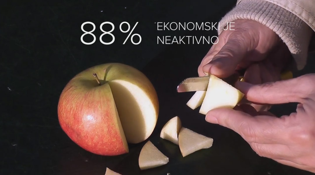
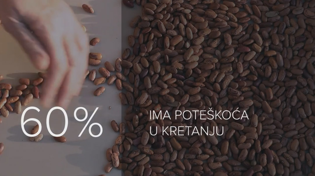
Bellow is an example of Video Infographics, a data-driven video story, I created for the Involved not Invalid project led by YIHR – Youth Initiative for Human Rights. ■